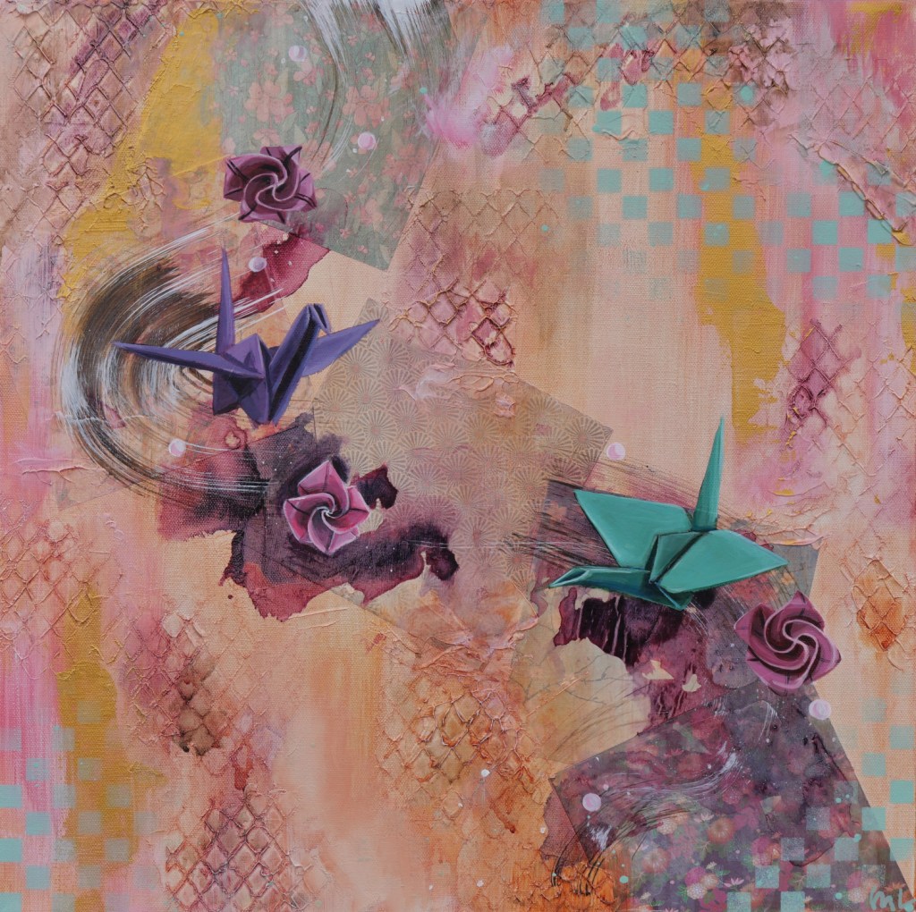
I took a big step back from my internet presence to focus on making art (like the piece that is the featured image of this post and will be available at Pancakes & Booze Detroit in two weeks…more on that later) and being human. And when I came back to update my website, I was not happy with what I saw. I felt like it was overdone, a little bit much – and it just didn’t represent me.
Being an artist, I think it is really easy to overdo branding when you are first starting out. You try to make a logo and pick a couple colors to show who you are to the world. That can be really limiting when you’re used to having the world of color and materials at your disposal. In fine art, limitations can be a wonderful thing for creativity because the challenge of finding how to best put your thoughts onto your medium with self-imposed limits can lead to breakthroughs. Whereas, graphic design is the extreme of that.
I think a lot of people may think that fine artists should be able to transfer their art skills to graphic design because they are related, but they really are on opposite ends of the visual arts spectrum. In fine art, oftentimes the visual story is grandiose and has a lot of depth, whereas the goal with graphic design is to get the message across as concisely as possible. So for fine artists, we tend to overdo it.
After taking a break from my blog and website, I came back with fresh eyes only to say, “Yikes.”
My visuals were garish, my colors were all over the place, and my writing was just awful. Reading the first blog posts again was a trip to cringe city. There was a common theme, however: colorful. When I picked my brand colors, I picked colors from all over the color wheel. Muted magenta, turquoise, dark gray, and pale green.
Even the language on the blog was colorful, but not with swearing. That would have been more appropriate. I had words like “elated” and “revelation.” I don’t think I have ever said “elated” out loud other than, maybe, reading someone else’s words out loud.
When I first started blogging, it felt very forced. I had a hard time getting my thoughts on the page. I was trying so hard to look like I knew what I was doing, while still being authentic to myself, that it was just a jumbled – but flowery – mess. I do not know what I am doing, but I am figuring it out.
In the last months, I have just kept putting one foot in front of the other and just doing that has earned me a little bit more confidence when putting myself onto the internet. I am actively simplifying the site and hoping I can mold it something I am a bit more proud of. Sometimes these things take time, though. First things: here is a post with a bit more authentic-Megan-voice.
Maybe it was Grace (my inner critic) writing and designing things before. Which only reinforces the idea that if Grace was a real person, I would want to punch her in the face. But I wouldn’t, because Megan is better than that. But Grace, that girl is an unhinged psychopath waiting to stab you while hiding behind purple prose.
In other news, I will be showing art at Pancakes & Booze, a traveling art pop up show, at Tangent Gallery in two weeks! Very excited about that. I will be peddling the painting featured as the image of this post, as well as two others and prints/stickers while stuffing my face with pancakes. Hope to see you there.

Leave a comment